GERMAN PAVILION EXPO 2015 MILAN – COMPETITION 2ND PLACE
Competition design 2nd place, German Pavilion EXPO 2015 Milan
Together with the creative agency facts and fiction in Cologne, gtp2 was a close and frustrating runner-up in the design competition for the German Pavilion at Expo 2015 in spring 2014. However, we did manage to beat the great Zaha Hadid into 3rd place. Here we show what our design looked like.
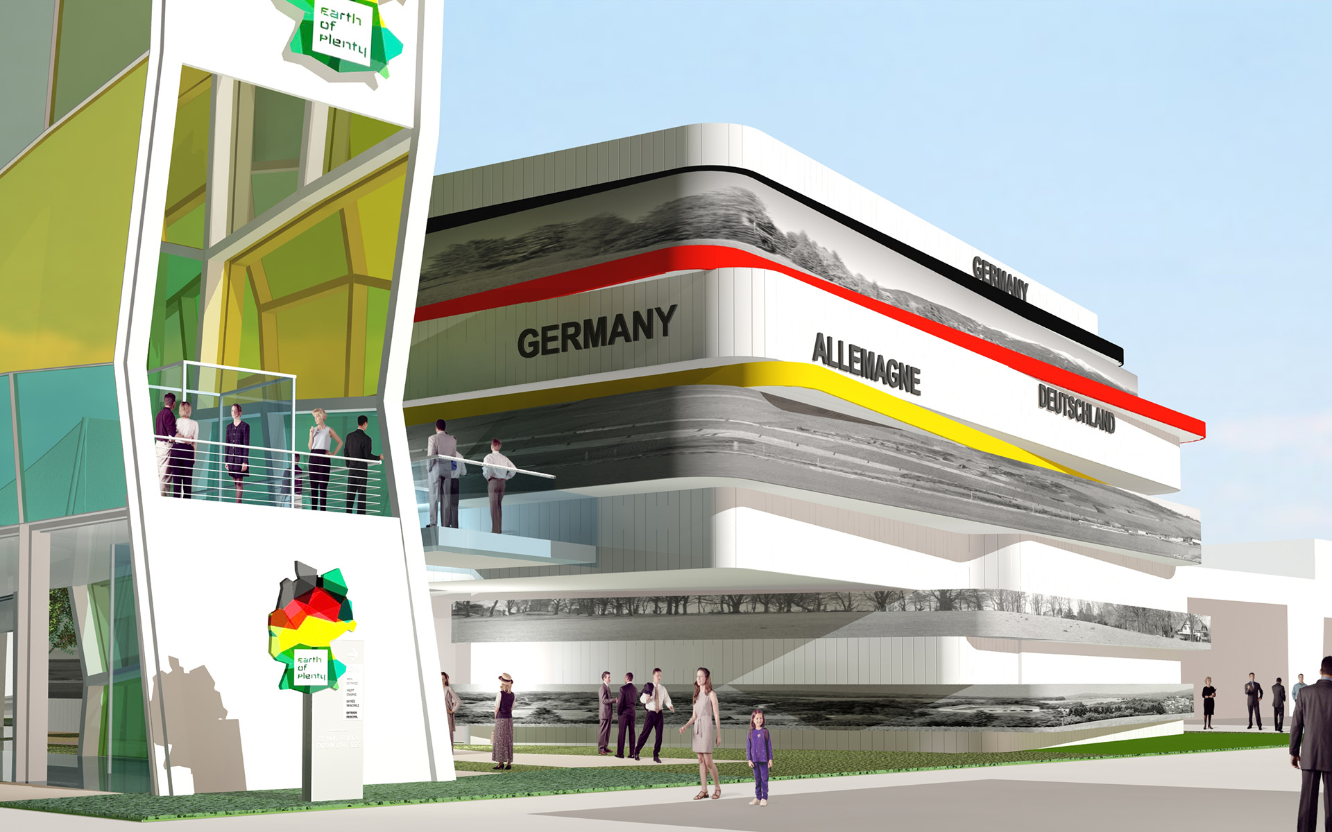
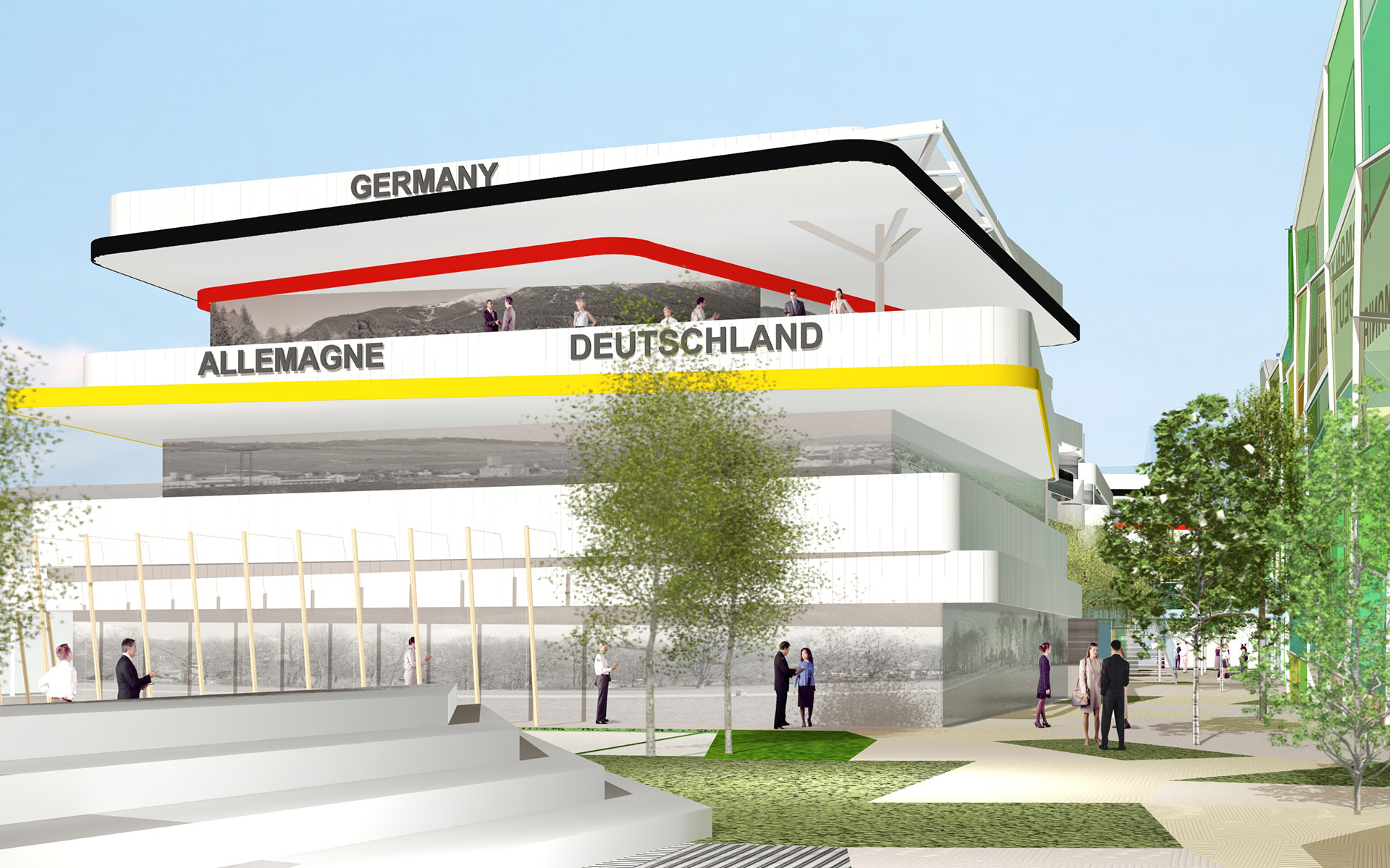
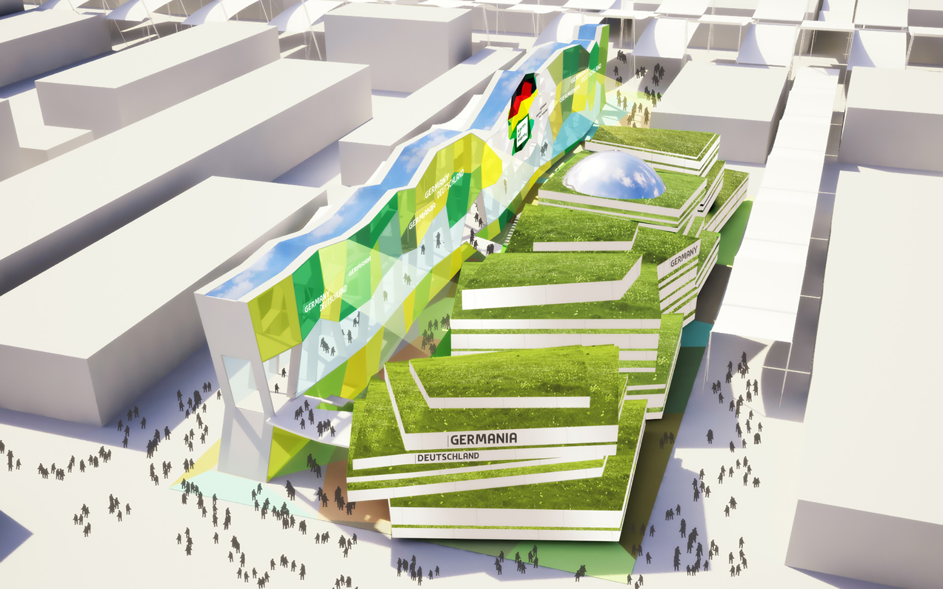
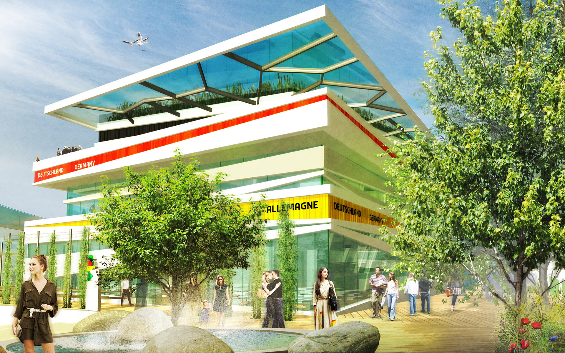
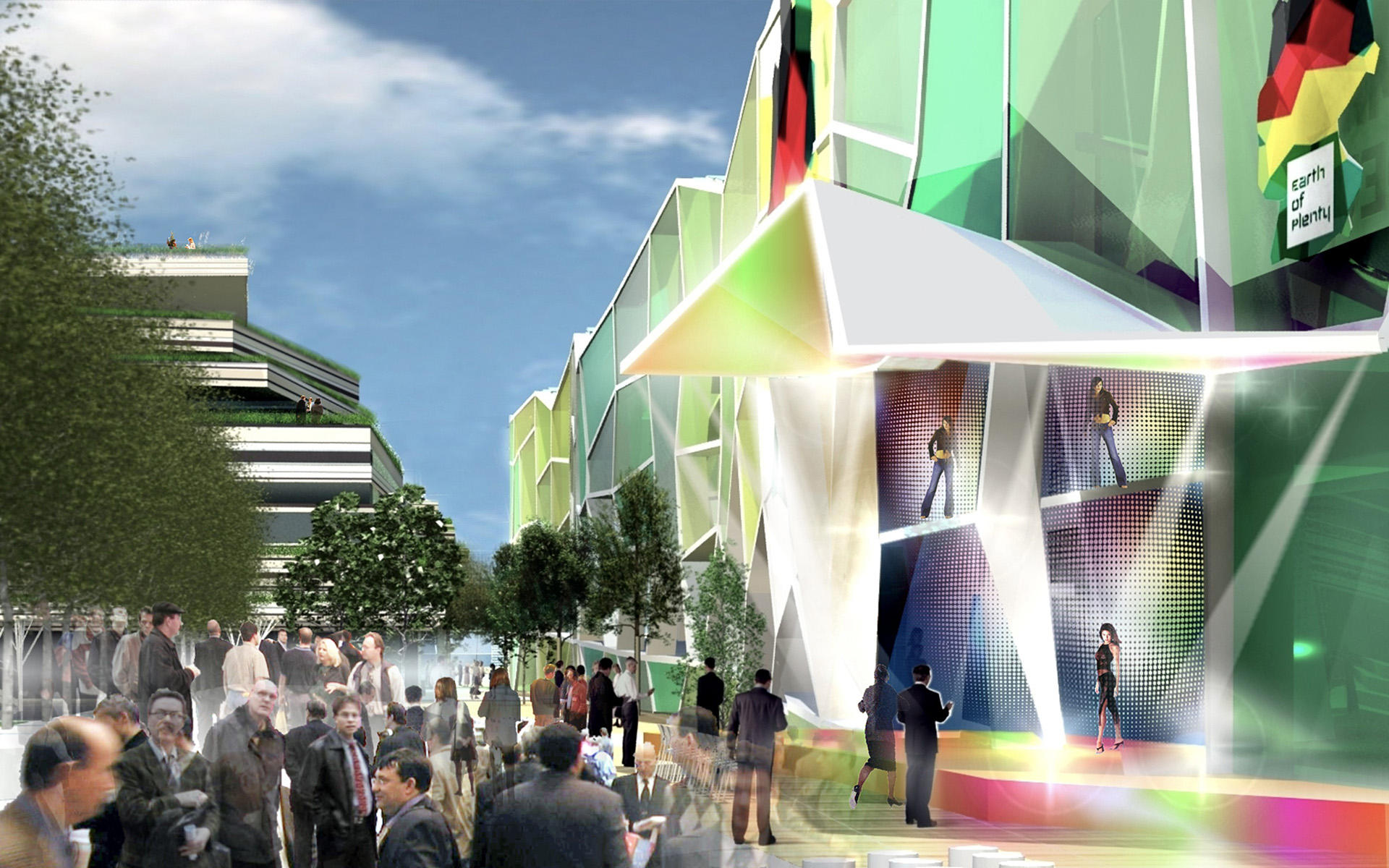
The German Pavilion had to assert itself against the dominant design of the roof cover of Expo’s central axis, the Decumanus, with a strong architectural statement. Two diverging and yet related building elements created a unique visual identity and exciting contrast.
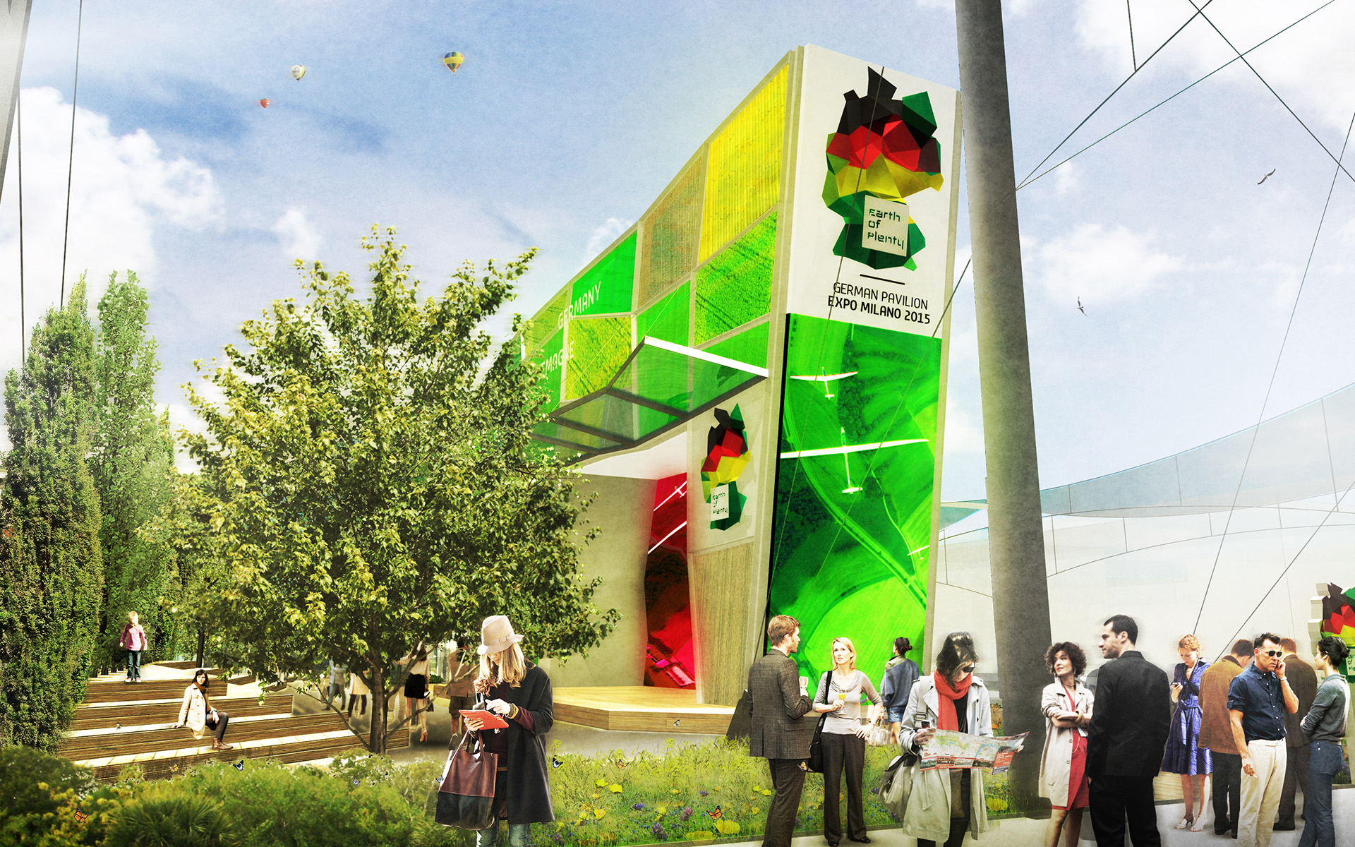
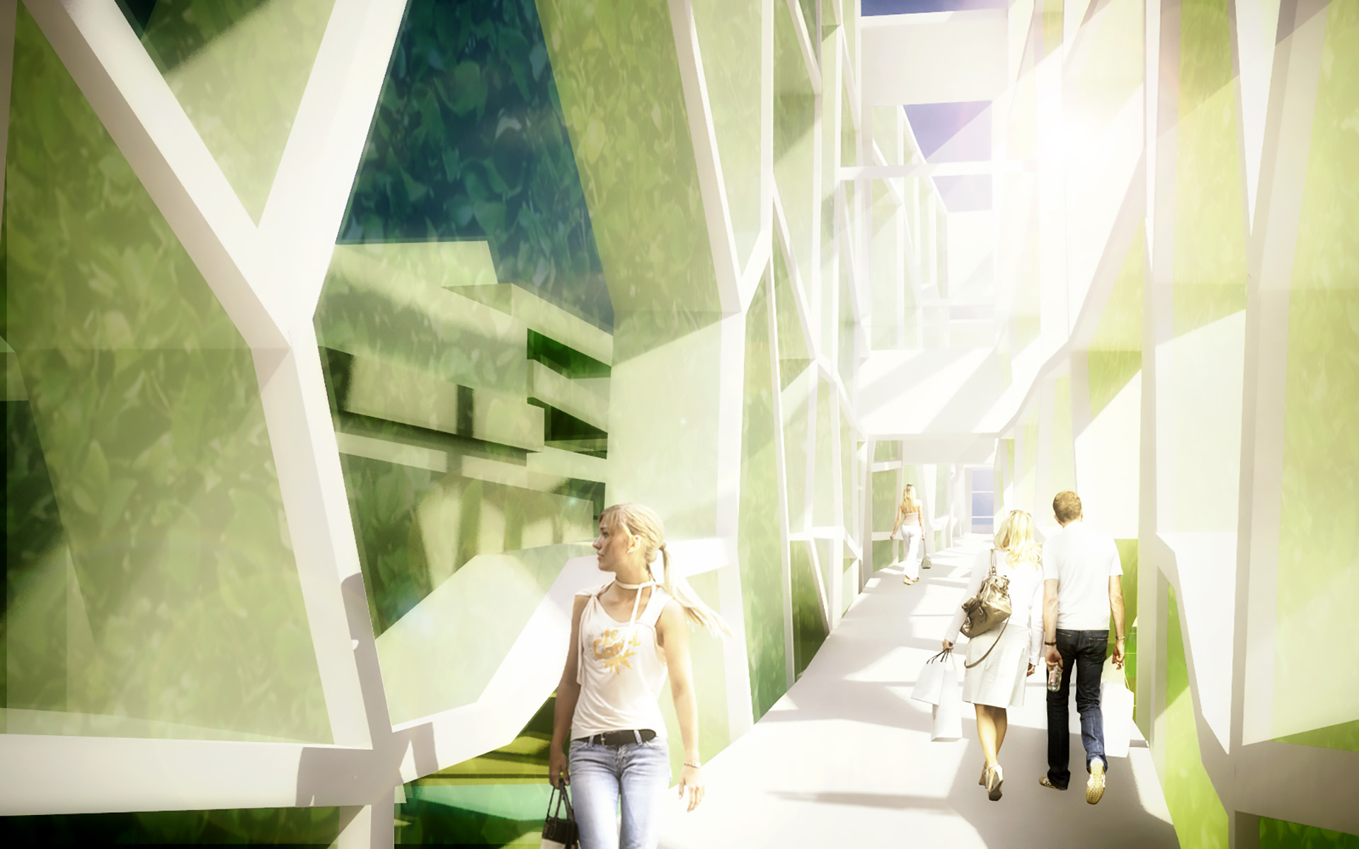
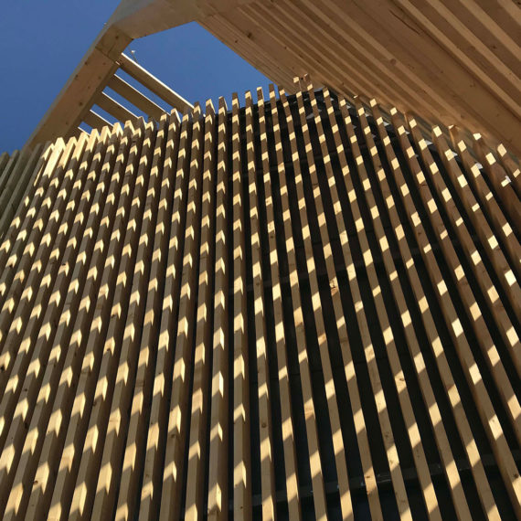
A 134 m long and up to 17 m high vertical framework structure called the “Vertical Landscape” dominated the entire east front of the site. This structure contained the main entrance and plenty of content, creating a clear and understandable architectural sculpture, which formed a symbiosis between thematic content and architectural design.
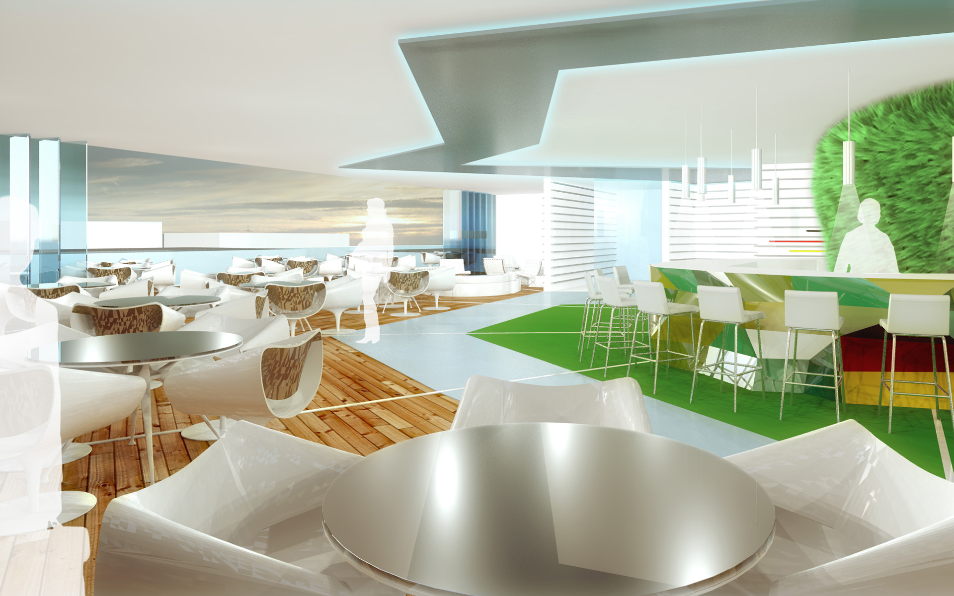
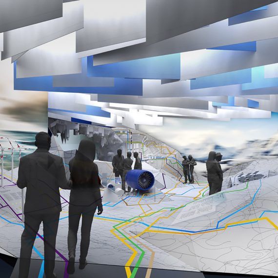
The Vertical Landscape contained a gentle ramp surrounded by an informative and entertaining range of exhibits. An open green axis, named the Saisonale, ran through the site from north to south, separating the Vertical Landscape structure from the main pavilion buildings and providing a welcome breathing space for relaxation. The exhibition pavilion consisted of several separate building blocks featuring a stack of landscape layers, forming a lively architectural sculpture, inspired by the Vertical Landscape. The layered design of the main building provides a calming contrast to the geometric pattern of the Vertical Landscape’s field plots.
FACTS
client: BMWi Federal Ministry of Economics and Energy
organiser: Messe Frankfurt
creative partner agency: facts and fiction
site area: 4.913 m²
gross floor area: 2.890 m²
budget: 26 m €
client
BMWi Federal Ministry of Economics and Energy
Date
08. August 2014
